University of Phoenix website
"Why Phoenix" section UX/UI, content restructure and visual redesign.
Business need: Increase inquiries and enrollment and to build credibility
User need: Get answers about programs to help make a decision on whether the university is a good fit for their current life situation.
Challenge: A daunting onslaught of information without immediate answers to specific questions. Client focused on what to say vs. the students need.
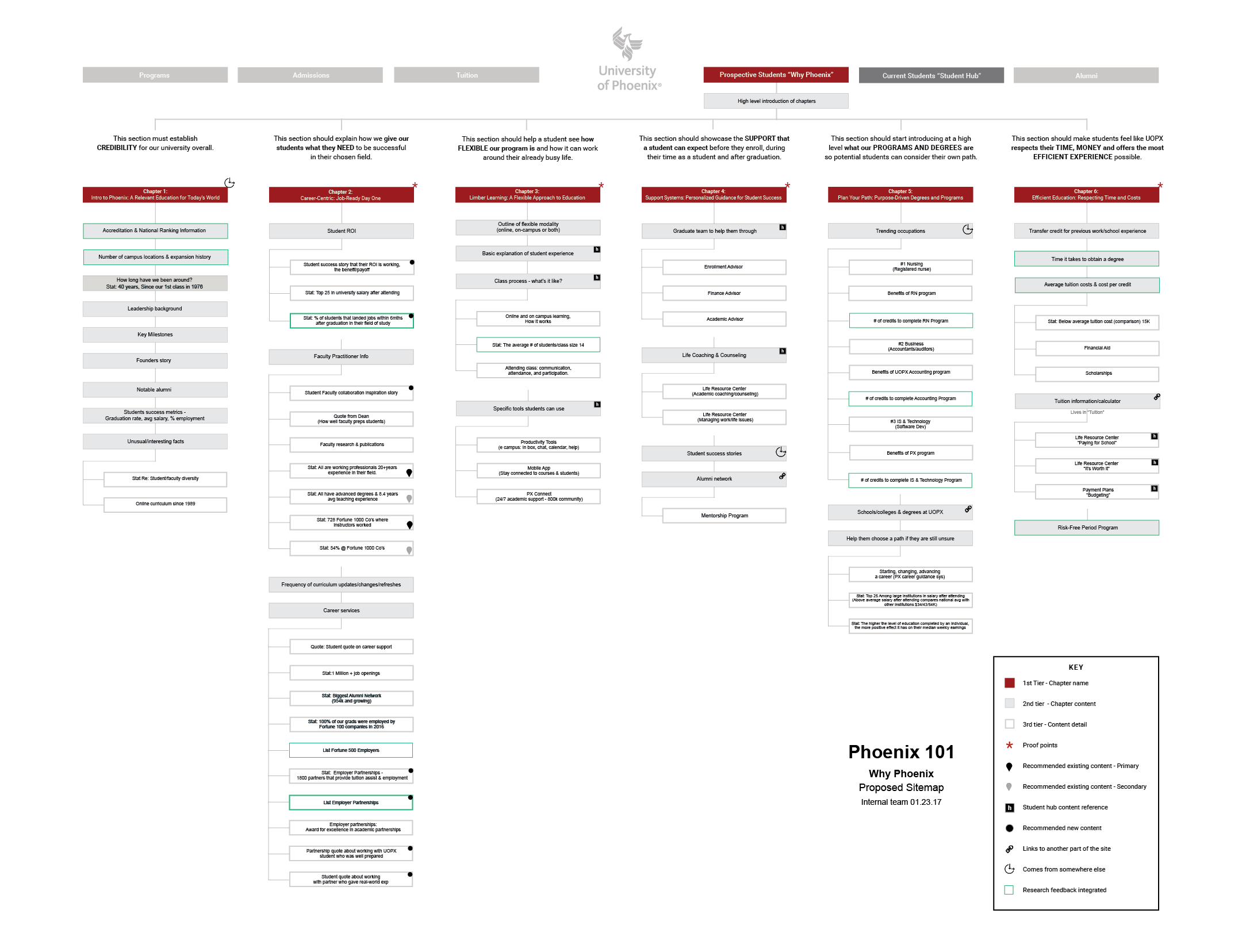
Solution: We presented two solutions. The first, organized content to answer potential students top-of-mind questions during the consideration phase in a clever "Chapter" format. The second solution organized content to communicate the universities five pillars of strength.

ACD/Art Direction: Brian Farkas and Tylynne McCauley. Design: Matt Jensen and Chris Welsby. Creative Technologist: Jefferson Wu. Strategy: Kaleen Ogden. UX/UI and research: Stacey Savage


Design, UX and strategy worked closely together to mould "Why Phoenix" so that it answered the user’s top-of-mind questions during the decision making process.

The sitemap above reflects a "Chapter" concept and solution to organizing content.

Content strategy/sitemap expanded


The chapter concept designed

Client working session/content reworked

The revised sitemap above reflects the five pillars of program strength: credibility, flexibility, support, student needs, time/money. The creative below reflects this new direction.


Pillars concept design


